SOS TREATS
Visual identity for the new cookie co. in town.
Inspired by the origin of the SOS acronym, I took to morse code and made it the heart of the visual identity. This functional mode of communication was infused with the quintessential playfulness of baked sweets to create a vibrant, fun identity that establishes SOS treats as sweet salvation.
SOS is … - - - … in morse code. This code is integrated into the logos, and stands alone for smaller applications.
In digital applications, the logo blinks and morphs, borrowing from the action of tapping morse code when sending out a message.

The use of Druk wide as a primary typeface balances out the sweet colour palette and brings an edge to the SOS brand. Keeping it playful, but far from saccharine. All caps are used to communicate the brand’s immediacy.

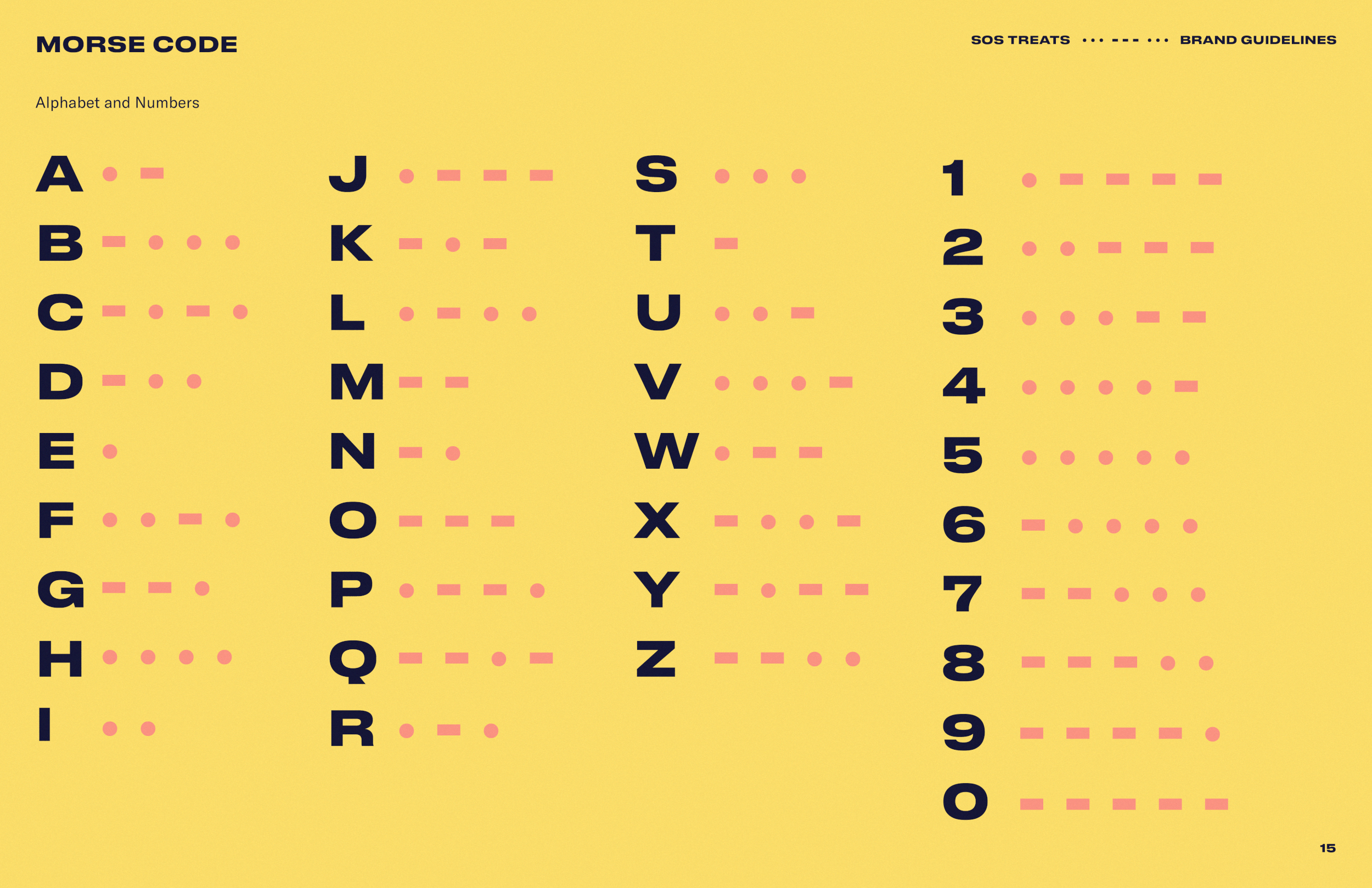
Morse code doubles as graphic patterns with a hidden meaning. Dots & dashes envelop words to create a grid-like system that works on multiple applications.
Everything the brand puts out into the world is an opportunity to send out fun hidden messages.


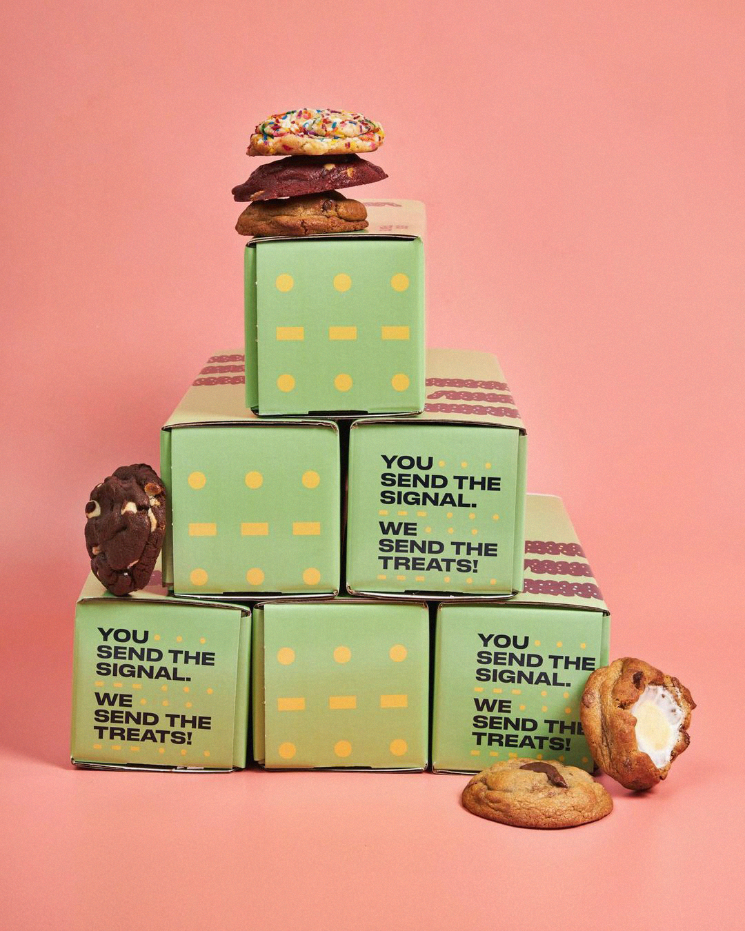


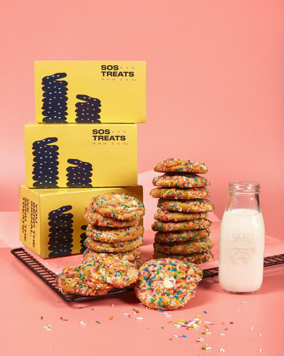

The packaging comes in 3 sizes for varying levels of cookie cravings. 6 cookies? 12? 24? The stacks of cookies line up to a towering effect when packaging is displayed in-store.


Client: SOS Treats
Agency: Juliet
Year: 2021
Creative Direction: Denise Cole & Laurent Abesdris
Design / Art Direction: Maria José Arias
Copywriting: Angela Brock
Illustration: Duncan Collis
Photography: SOS Treats


©2025 (Studio) Maria José Arias