
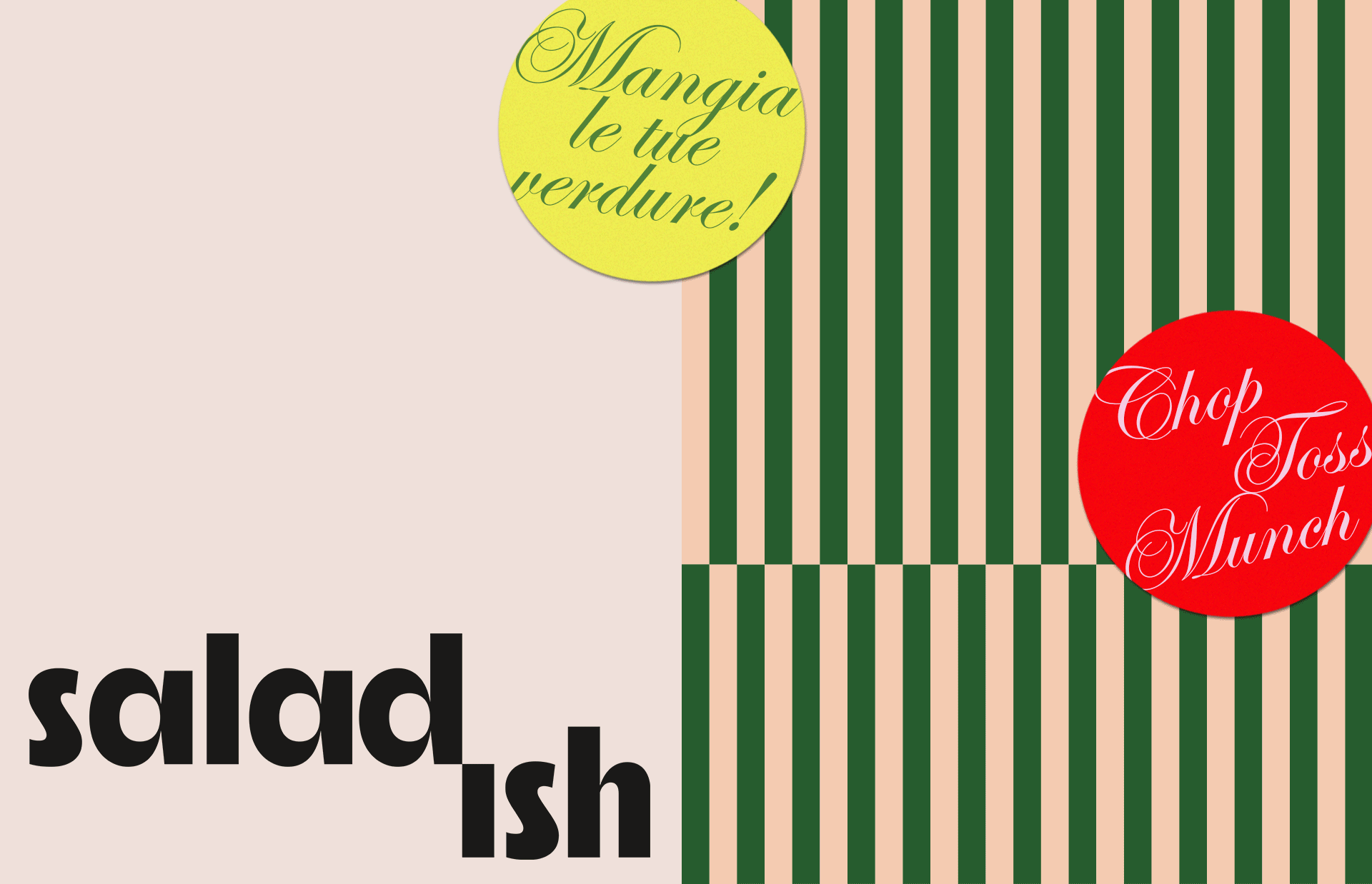
SALADISH
A visual identity for a salad bar in Milan.
The identity was created to pitch investors and secure funding. After looking at the competitive landscape — a sea of health-forward messaging — it was clear there was an opportunity to give an edge to salads, establishing Saladish as the place where salads and veggies are reimagined.
The logo uses crisp type with geometric counters, sharp angles, and high contrast strokes. It’s chunky for an approachable and warm feel, yet feels sophisticated and timeless. The -ish appears to be chopped off the logotype, alluding to the process of making our delicious salads.
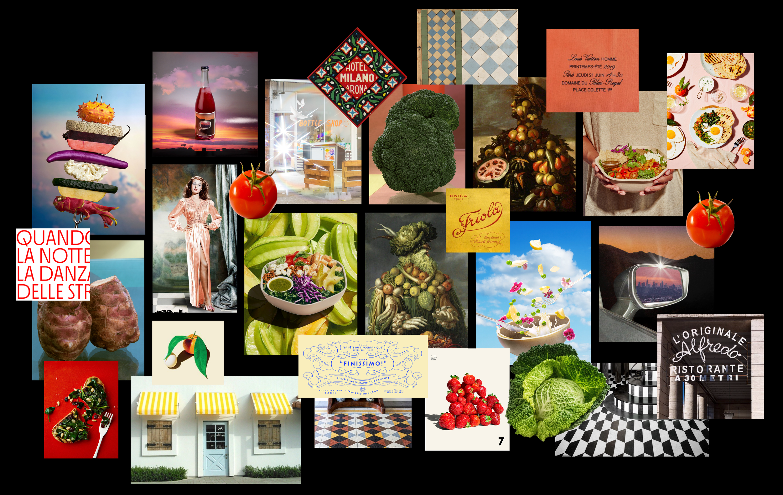
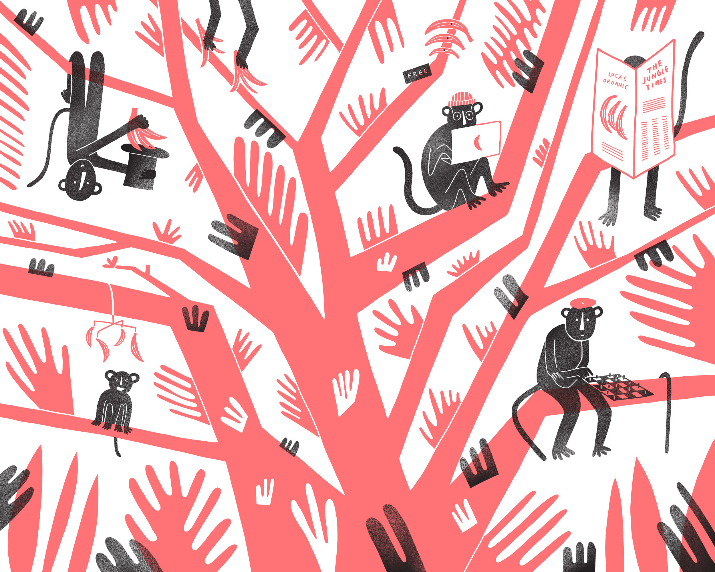
Saladish stands for Californian inspired salads, born in Italy. This guided all visual research and the world of the brand. I leaned into the celebrity history of salads, born in the 1940s in California. Part of salads’ success amongst celebrities was due to ingredients being finely chopped, which helped avoid sloppy eating while dining in silky gowns.
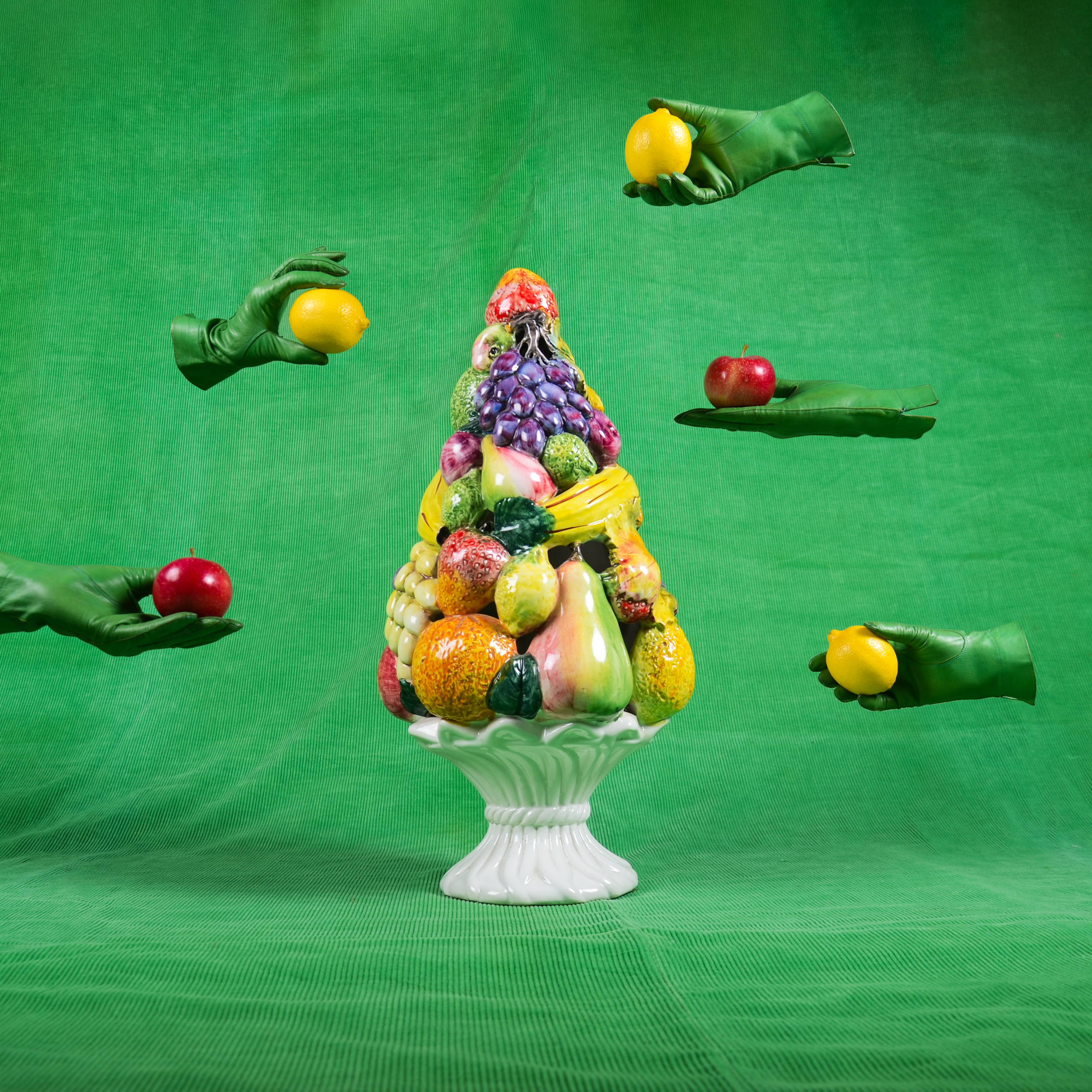
I was also inspired by Italians’ love and attention to fresh ingredients. This is epitomized in 1500s Milanese artist Giuseppe Arcimboldo’s art — his work really says something about the legacy of Italians’ passion for great produce.
Beyond these two historic starting points, I leaned into our intuitive idea of California and Italy — gorgeous sunsets, delicious produce, glitzy celebrity culture, beautiful typography, tiles, striped awnings, calligraphy, and more tiles, naturally.
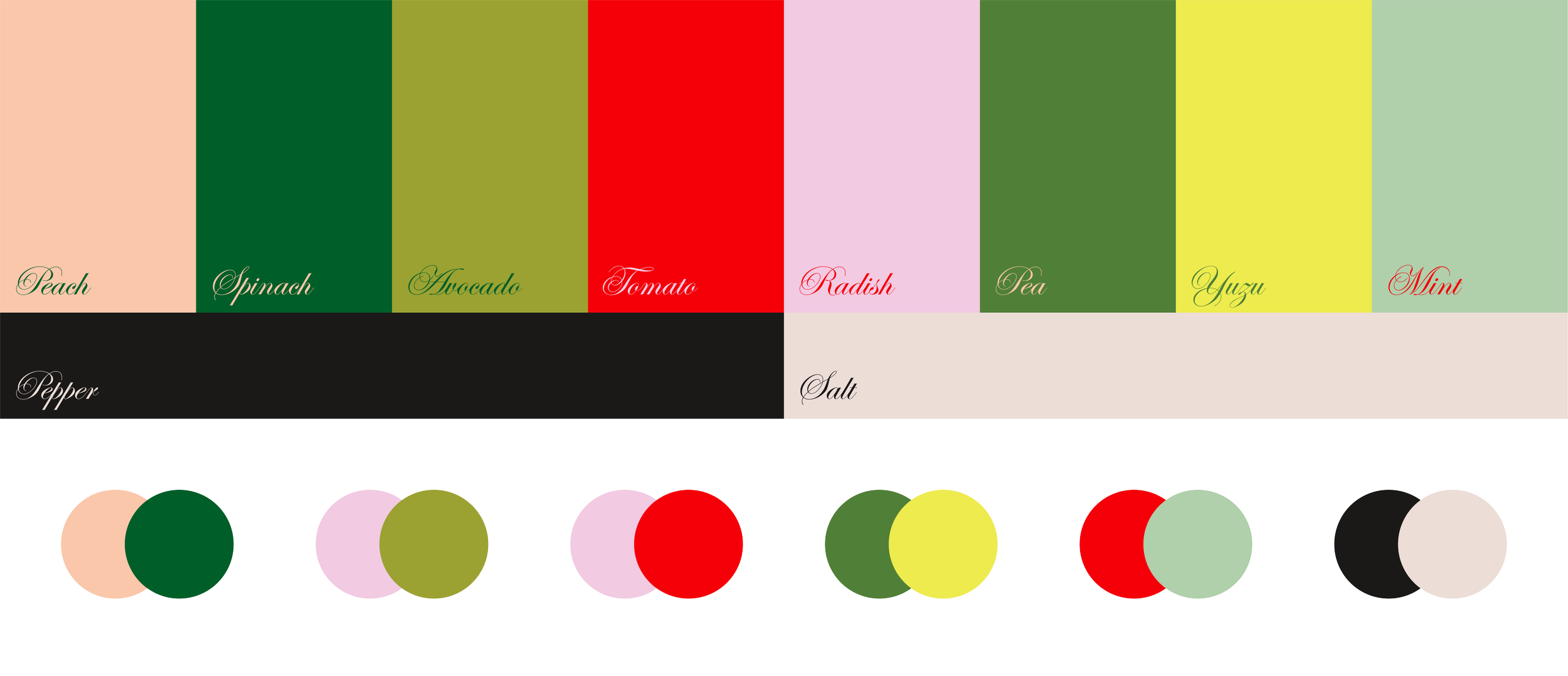
The brand patterns are inspired by Californian awnings, Italian tiles, and finely chopped veggies.

Colourful salad bowls double as graphic elements across the identity.


Client: Saladish
Year: 2022
Art Direction / Design: Maria José Arias


©2025 (Studio) Maria José Arias